Have you experienced of someone telling you that your choice of color is awful?That your website design makes the text hard to read and any other complaints relating to color? If you are sure that your choice of color is cool, then there must be something wrong with that person. There are several factors to consider, but today, we will restrict that to a possible color blindness of either you or the viewer. But what is color blindness is in the first place?
Color blindness or color vision deficiency is the inability or decreased ability to see color, or perceive color differences, under normal lighting conditions
The hard part with regards to colors is it not a "real" object. What I mean by this is, colors just exists in our minds. It's just an interpretation of our mind of the light particles hitting our eyes. When you are seeing an object, like for example a chair, you are not actually seeing the "chair", but just the particles of light hitting the chair bouncing back to your eyes. This light particles depending on the frequency is what we perceives as colors.
Each color has its own frequency on how each light particles arrives. For example when you are looking at the rainbow, the violet has the highest frequency of light particles. Anything beyond violet have so high frequency that we cannot see it anymore (the light still exists but we cant just see it), to the point that it could hurt our eyes. That is why we have the popular UV-ray or Ultra-violet ray protection for eyeglasses, "ultra" means beyond.
But since the eyes of all people is not all equal, the same frequency of light can be interpreted by a particular person as different color than another person. This is what usually happens when someone told you that your color choice is awful. You might be seeing a color combination as cool, but not by others.
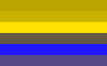
There are three common kinds of color blindness, let's consider this rainbow colors for example:

This is how a "normal" eye see things. But for a person with "Protanopia" on which the red appears black, this is how the same rainbow image looks like:

For a person with "Deuteranopia" wherein the red–green hue is moderately affected, this is how it looks like:

Then for "Tritanopia", wherein there is total absence of color blue. This is how it looks like:

As you could see in the above conditions, a lovely color of rainbow can be viewed differently by three persons. A website, being published in the Internet will be viewed by millions of people with different possible color perception.
The big question is, how do you test each those color perception in your website?
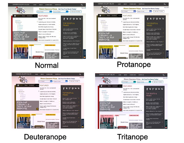
There is a web service called ChromaNope which offers a color blindness simulator. This simply allows you to enter the url of your website, and it will generate three screencaps of your website, each a simulation of the three most common color blindness. This website for example has this four screenshots:
As you can see in the screenshots above, ChromaNope showed me how this site will looks like when viewed by three different person with color blindness. Although you could not design a color scheme to please all eyes, it is still great to test so that you could better design your site and at least make the text readable to all audiences.
Did you find this useful?
I'm always happy to help! You can show your support and appreciation by Buying me a coffee (I love coffee!).
